Actionaly Case study
Surfacing engagement data for better student outcomes
Our Challenge: Create an intuitive way to easily review engagement metrics in schools and districts using the Actionaly Admin panel.
ROLE: Research, UX Design, UI Design, Project Management
TEAM: Stacie Pearson, Sarah Conlon, Tina Ley, Andrew Propp
TOOLS: Figma, Miro, Whimsical, Zeplin, Paper/Pen
TIMELINE: 10 weeks
Background
Actionally is an EdTech app designed to increase parental engagement in schools. Living in an increasingly competitive market, they were looking to improve areas of the experience that were clearly lagging when viewed against their competition.
the administration portal was one of these areas. Originally created as a non-user facing part of the app, it clearly needed to improve its usability.
This case study outlines the path from generative research through design and development of the new admin experience.
heuristic analysis
Reviewing Usability
To get a solid idea of Actionaly’s usability we conducted an heuristic analysis, defined tasks to complete on the site, documented the user flow to perform tasks, and measured how easy they were to perform.
We found:
- Actionaly offers limited visibility into engagement metrics
- Response rates (%) and raw data details are provided on an individual activity basis only making understanding trends unintuitive and frustrating.
- the language and how information is organized in the product is hard to understand
- The UI is confusing.
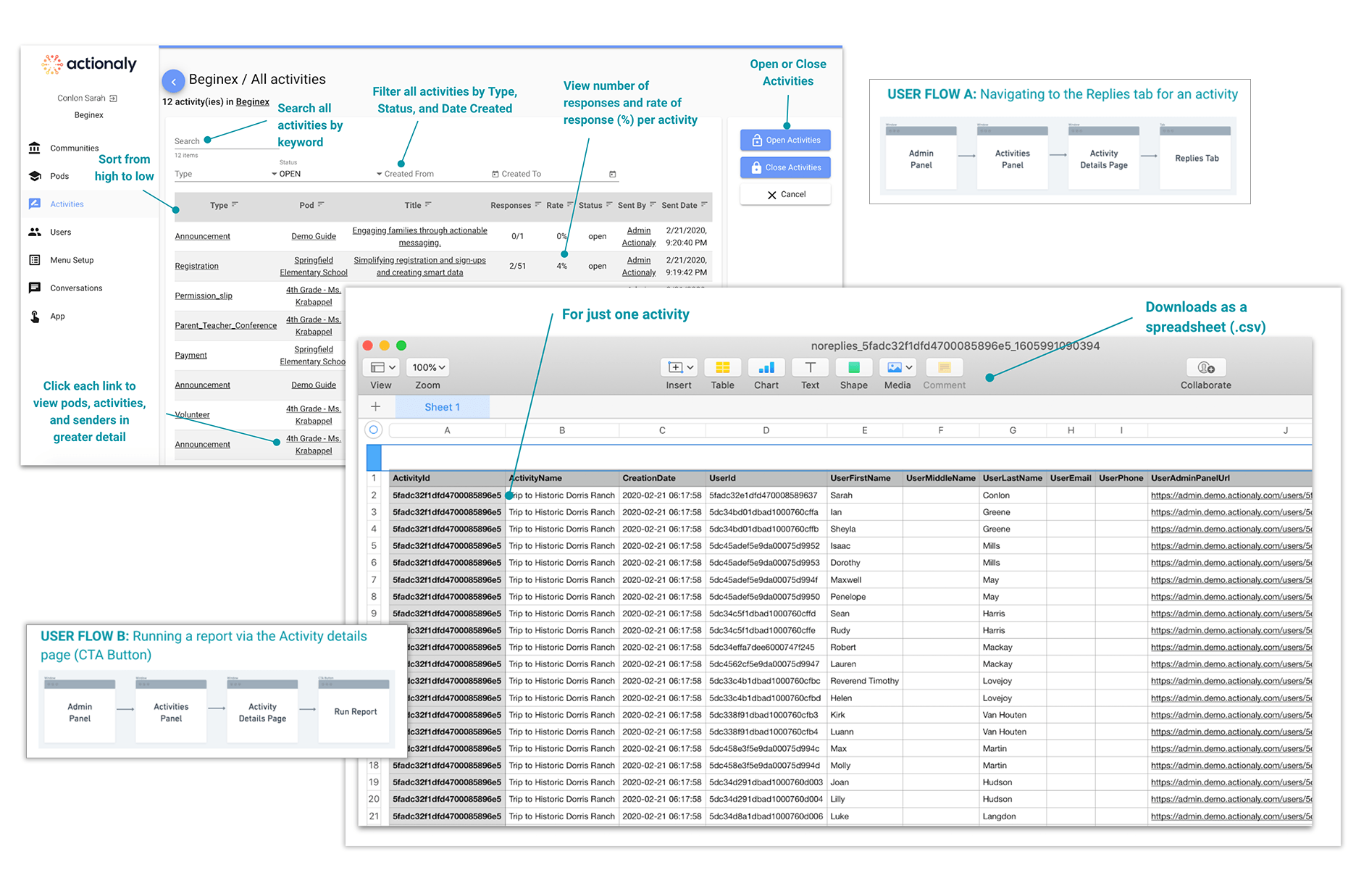
The screen on the left shows one way to view response rate metrics in the activities tab of the admin panel. It provides a way to run reports, but only per activity. The “not replied users report” on the right shows who to follow up with for an activity. The information is presented in a table, is not visual, and raises the level of expertise required to interpret the information.
Competitive Analysis
Exploring Best in Class(room)
Researching the competition helped us understand trends in reporting, specifically around the type of information captured and provided, what features were offered, what lingo was used, content organization, and if others provided visual dashboards.
There are many competitors in this category, and all have visual and dynamic dashboard offerings.
Only four directly compete with Actionaly: ParentSquare, Remind, Bloomz, and ClassTag.
Each took a different perspective on what information to prioritize and how they displayed that data,
Stakeholder Interviews
The Inside Perspective
What did internal stakeholders think of the experience? To understand this we ran stakeholder interviews with the CEO, a customer success manager, a JSON developer, and a UX designer. Here’s what we learned:
Key insights:
- There is an opportunity to improve current reporting with simplification & relevant engagement data.
- Admin Panel is unintuitive for users with poor navigation & confusing terminology
- Data reporting is avoided unless absolutely necessary
- A visual display of engagement data could be helpful, and was being used by the competition

Contextual, exploratory interviews were done virtually via Zoom due to the pandemic.
“The first 30 minutes of the conversation is explaining terminology. It requires them to invest quite a lot of energy and time because it's not intuitive. I just don't feel like administrators have that much time…”
– Emma Philippart, Actionaly Customer Success Manager
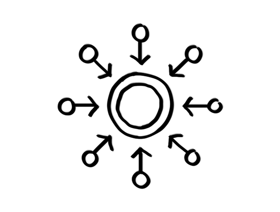
User Interviews
Admin Panel Users: A Tale of Two User Types
User Interviews helped identify product expectations, how, when, and why they used Actionaly, what they wanted more of and where the product was falling short.
Interviews also revealed something significant and interesting: There are 2 distinct and very different customers using the admin panel.
Task based users like secretaries and nurses that use Actionaly on a day-to-day basis. Their goals are very task oriented. Strategic users such as District Administrators that are interested in macro-level engagement metrics for strategic decision making.

Focusing on task-based users would mean fixing the existing reporting features within the admin panel.
Solving for strategic user would mean designing a whole new feature providing high-level data to support their needs.
Picking a Path. Feature Fix or Concept Test?
The discovery of the distinctly different user types was a pivot point for our team.
There were 2 paths we could follow, so aligning on one direction was necessary to keep the project on track. We regrouped with the client, reported our findings, and discussed the two options.
Ultimately after in-depth discussions with the client, reviewing user interview transcripts and evaluating our research analysis through a concept test lens, we pursued the 2nd path.
The Pivot
Concept Testing
With the new direction chosen we needed to quickly reset a few tasks.
- Line up and interview more strategic users to ensure we’re getting the right sort of insights.
- Rework the questions to reflect a concept test.
- Create a low-fidelity prototype to test the product concept.
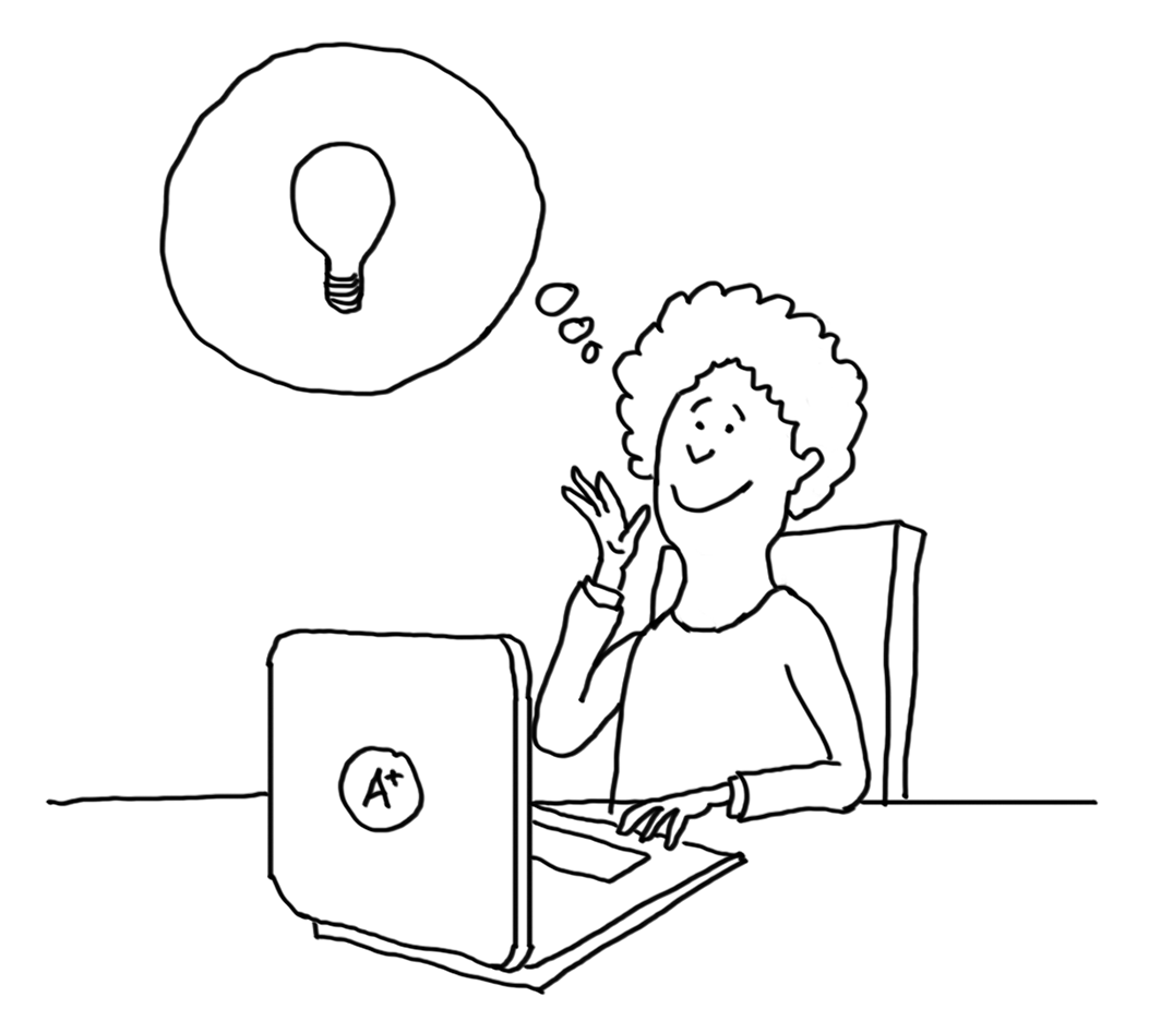
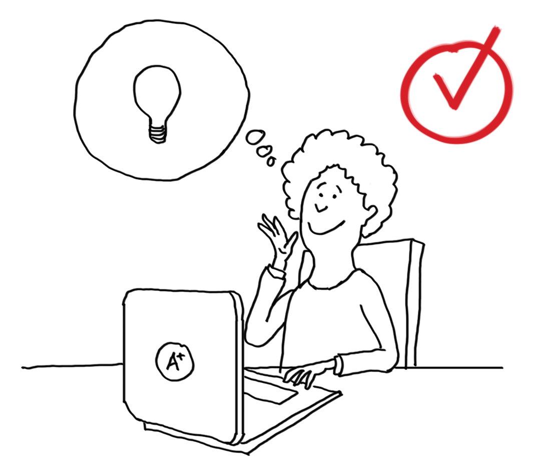
the visuals triggered comments about other interesting data points and how this information could be used.
Visual Aids Proved To Be Pivotal in Our Concept Testing
Customers want some form of customization
They want to see data at various levels and trends over longer periods.
Benchmarking, and segmentation by special demographic groups was needed.
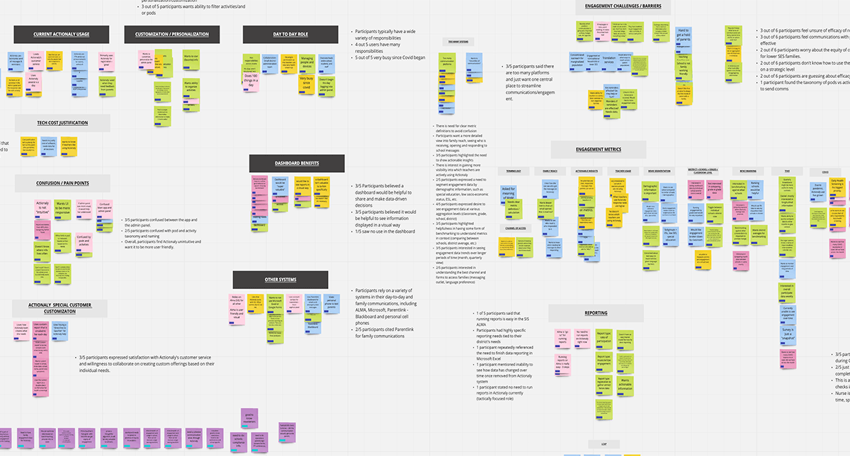
Synthesis
Theming and Insights
The team was entirely remote, so we used Miro to consolidate all the research, collaborate on affinity mapping, create empathy maps, and pull out valuable insights.
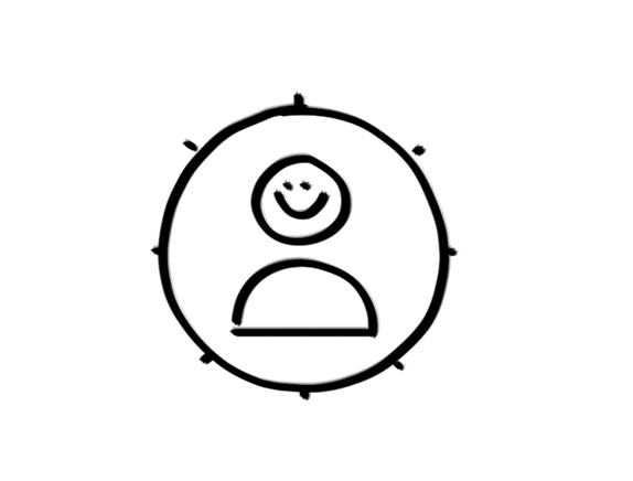
Data aggregation
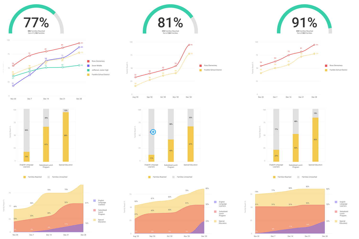
80% of participants want to see data at various aggregation levels (classroom, grade, school, district)
Data trends
60% of participants want to see engagement data trends over longer periods of time (month, quarterly view)
Benchmarking
60% of participants wanted benchmarking to understand metrics in context (between schools, district average)
Demographics
40% want to segment engagement data by demographics (special education, socioeconomic status, ESL)
Design Direction
Insights Shaped the Solution Design
CENTRALIZED
They need access to aggregate data in a single location.
PERSONALIZED
They want to personalize their info so they can see exactly what they need, right away.
SHAREABLE
They need a way to easily share the information with stakeholders.
How might we provide a district administrator a way to easily monitor family engagement so that s/he can make informed, data-driven decisions to improve student success?
Sketches
Information in Formation
Features
We started sketching out the data in the dashboard, as well as the dashboard itself. We sketched ways to filter, customize and share content, a key part of our design direction. We then made revisions based on feedback and voted on the best solutions to test on users.
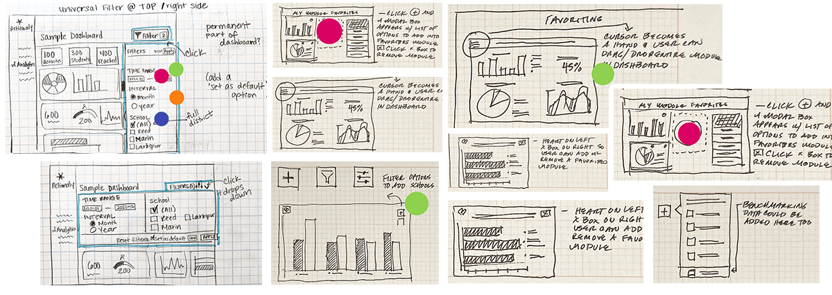
We ideated on the best ways to present features for filtering, customizing and sharing content.
Data Viz
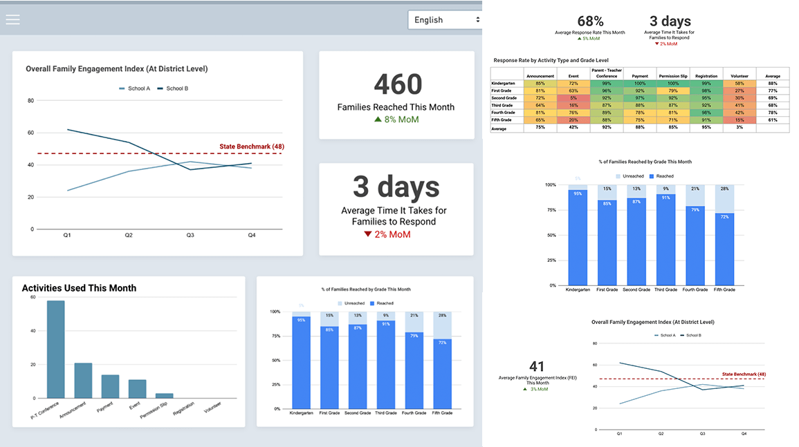
Next we focused on choosing and sketching the appropriate data visualizations for the information. Easy to understand visualizations are key in creating a lovable analytics dashboard. Many hours were spent researching how to simplify complex information while still offering the appropriate granular data needed.

We closely evaluated each proposed visualization, simulating whether they could be filtered by time (week, month, quarter, year) or segmented based on factors like grade level, socioeconomic status, and other demographics.
Task Flows
Moving Through the Experience
Task flows helped us establish how our user moves through the dashboard to achieve their goals, and how we could best design the product to provide an optimal user experience. These processes happened in tandem, one informing the other, improving each time with iterations and feedback.
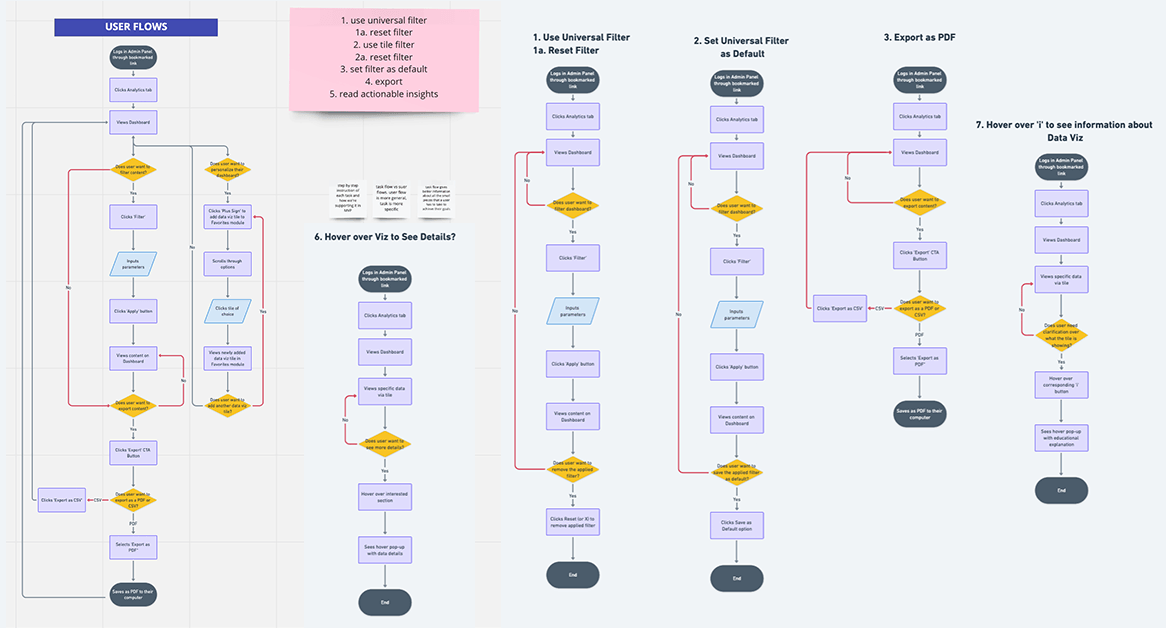
Due to the nature of the Job to be Done, the task flows were shallow, but there were many, including filtering options, saving preferences, and exporting data.
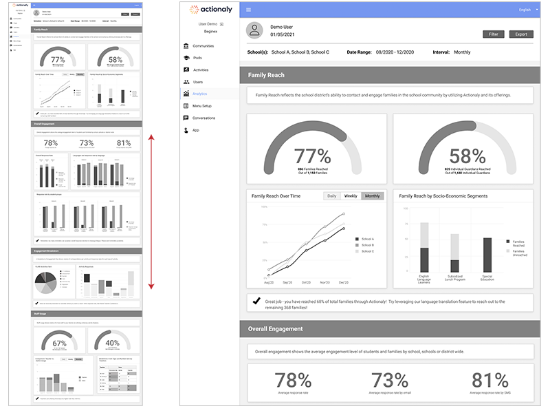
PROTOTYPE EVALUATION
Testing Design Usability & Desirability with Users
Testing would help determine: If the IA makes sense, if content is organized properly, and if the visualizations could simplify complex data.
Testing highlighted 3 main areas for design improvements. Specifically; scrolling, filtering, and data visualizations.
Scrolling
The dashboard was designed with infinite scrolling, thought to be best because all content was visible. User testing revealed this was too overwhelming.
- Users had to scroll quite a bit to see all the sections
- They forgot how they had filtered the content
- Lots of scrolling to re-filter and to export.
The tabbed design:
- Eased cognitive load and enabled full visibility and accessibility of all dashboard sections—2 valuable improvements
- Allowed for quicker access to filtering and exporting

Filtering
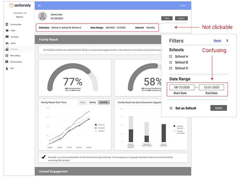
A filtering modal opened just below the filter button, so everything could be filtered in one modal.
User testing showed participants were clicking the info in the header area—which showed the filtered state, but wasn’t clickable. Date input fields were also confusing and difficult to use.
Clickable filtering buttons—for schools and dates, allowed for more control, and greater visibility of the filtered state.
Date range interactions with options for most used spans, and a date selector were also added.

Data Visualizations
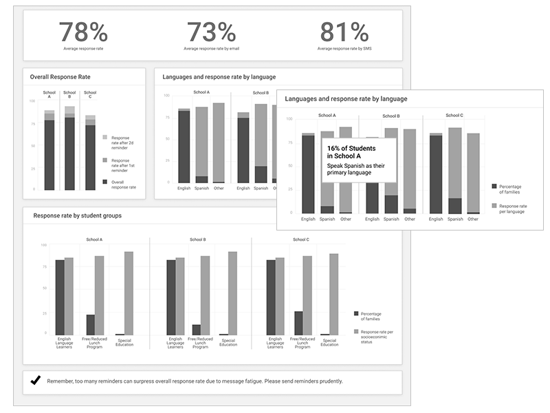
When testing, we saw that too many similar data visualizations (bar charts, for example) made the content feel confusing.
Participants also wanted clearer data labeling, so we removed information only available on hover and embedded it into the data viz.
Updates limited bar charts and broadened other types of visualizations.
Color was used strategically, with an eye on brand attributes while paying attention to contrast, variety, value for accessibility.
Learings
Key Take-Aways
Communication is Key
At times, there were decisions that challenged our understanding of the objective and scope of the product. Maintaining close alignment with stakeholders, especially if business decisions can impact users’ experiences is key to building the best solution.
Pictures Are Worth a Thousand Words
Get creative in user interviews when necessary. With complex topics like data, which can be difficult to digest, visual aids go a long way in connecting concepts to experiences. In this case they sparked great conversations leading to better insights and a better product.
Advocate for MVP
It’s easy to get distracted by the many great feature ideas that come out of usability testing, but remember to prioritize what is essential and provides the most value to the user for a minimum viable product. Otherwise, things will likely get out of hand.
Don’t Reinvent the Wheel
Especially when dealing with a user base that may not be the tech-savviest, use established, branded design patterns and systems, or leverage widely used patterns to reduce cognitive load. These familiar patterns make it easier on the user and saves us time!