Anarchy
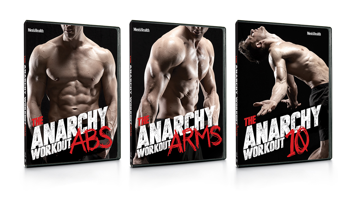
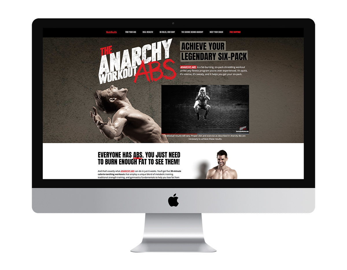
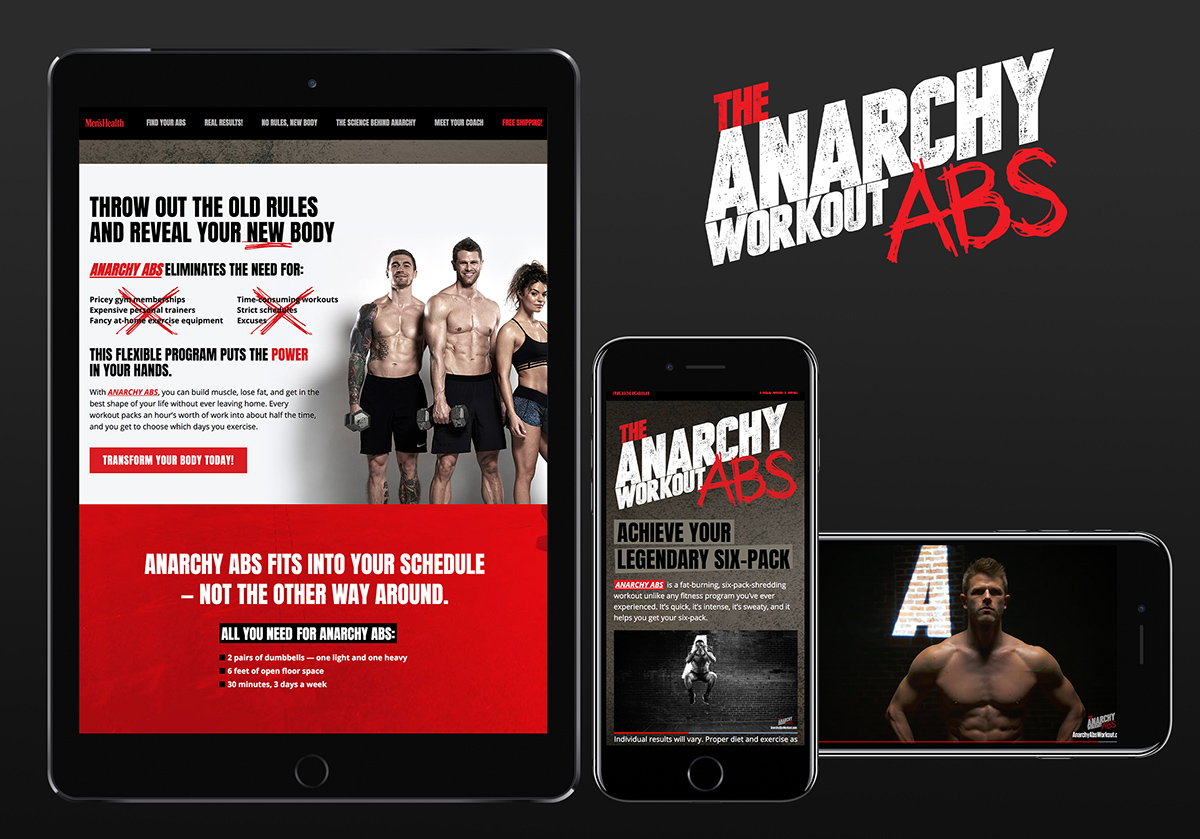
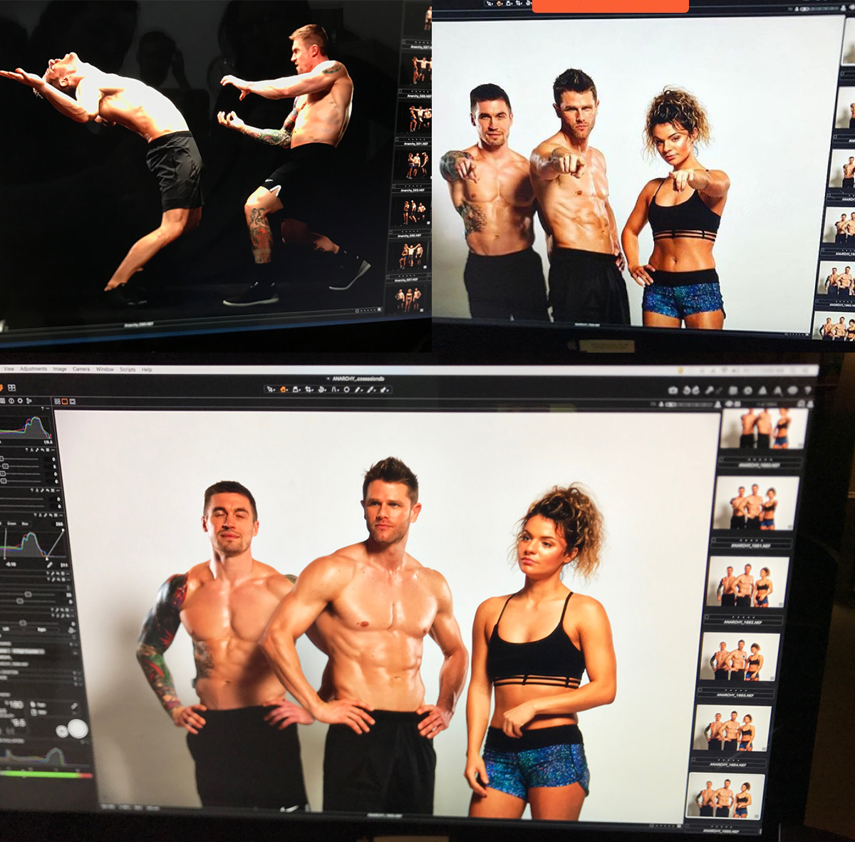
The title of the workout gave us the idea to give this product a Fight Club feel. With desaturated imagery, a single pop of red color, and added noise, we created a product that looked grimy yet beautiful and sophisticated. The workout creator, Andy Speer, was the perfect mix of lean and muscular, and we were sure to keep him unshaven and a bit rough looking. This art direction was also used in the photo and video footage, crating a beautiful, united campaign.
Shown here are examples of the site design fo both desktop and mobile, the package and logo design, and some swipes from the photo/video shoot.
ClientMen's HealthProjectAnarchy Abs, Anarchy Arms, Anarchy 10RoleBranding, art direction, web design, strategy, logo design, video and photo direction, package designURLsecure.menshealth.com


