Rodale’s Real Food
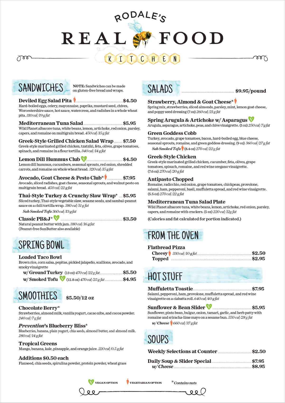
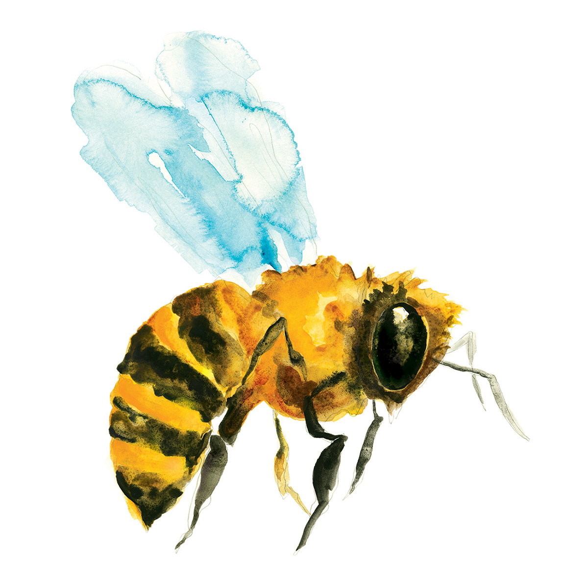
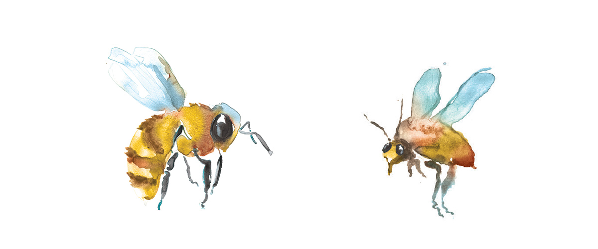
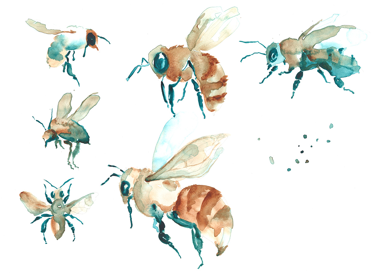
Rodale was creating a new event called the Rodale’s Real Food Festival, which through a series of events morphed into the Rodale’s Real Food Kitchen. The kitchen served organic, fair trade food, and the logo needed to reflect that. We sketched out a variety of logo concepts. This concept came from the importance of the honeybee in the food chain. Bees pollinate flowers and food, and are necessary for farmers crops to be productive. The bee was painted in a variety of styles and positions, and what you see here is the final logo.
ClientRodaleProjectRodale's Real Food LogoRoleLogo Design, Hand Drawn Typography, Illustration, Art Direction
Share

